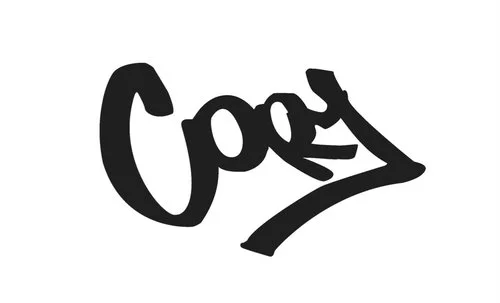
That logo doesn’t look like your name! What gives?
Some of you may have noticed that while my site is named for Clayton Chandler, my logo definitely does not look like Clayton. In fact, it looks like Cory. I sign my artwork the same way.
Cory does not look like Clayton.
So why the difference? Here’s the cold truth: Clayton is my middle name, and I have been using this signature since I was in high school, long before Clayton Chandler emerged as my artist name.
I came up with this nifty signature while visiting my Grandma in Phoenix. That was the first time I saw the Biltmore Hotel, designed by Frank Lloyd Wright. The experience was mildly earth-shattering, to say the least. I was enthralled by the way Wright adapted the traditional, old-world ornamentation of stained glass and statuary to fit his spare, geometric aesthetic.
That night, I cranked out a series of drawings that were mostly Batman sketches in a style that was really more like a gothic Art Nouveau than anything else. In the midst of all that, I did reengineer my signature, and promptly began slapping it on everything I produced. For consistency sake, I hated to do away with it once I settled on the name Clayton. Plus, I think it looks pretty danged cool. What do you think of it?

